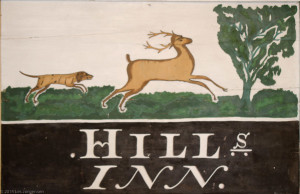
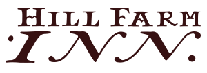
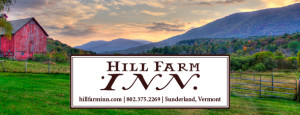
The Hill Farm Inn’s logo revamp is a favorite of mine; it hearkens back to the original Hill’s farm sign. The opportunity to create the Inn’s logo from this sign was fun, but not without its challenges… I needed to design several of the letters to the “Hill Farm Inn” typeface. Quite pleased with the final solution, it looks great large or small, on image and with type- all while steeped in the history of the property. yay. love my work.


