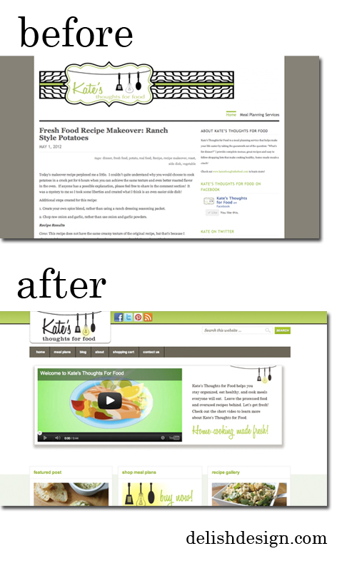
I’m really pleased with the final outcome of this revamped site. Kate of Kate’s Thoughts for Food came to Blending Circles & delishdesign with a need to take her website up a notch, to go along with the building excitement and development of her business. This was the site before; and after.
Some key factors for me in the improvement of the site are :
• the revamp of the logo and color scheme- brighter, bolder, readable and clean.
• restructuring information to easier bites – recipe gallery is easily navigable with different ways to search too.
• auto feed posts to the homepage, sidebars & footers of every page (what timesavers!)
• the shopping solution I love using for ecommerce clients developed by WooCommerce really helped to make the shop section of Kate’s site much more integrated to her site’s theme.

Also reworked Kate’s twitter background, and facebook imagery, to tie in better with the new site.
Take a minute to check out the site, shop her meal plans, and let me know your thoughts on the site we created for Kate’s Thoughts for Food!
Are you looking to have a website, blog or social media re branded, or built from scratch?
